2019 design #1153
2019 design #1153
Conversation
- Added base of new grid system.
- Added new margin/padding/visiblity helpers.
- Made header collapse to overflow menu on mobile.
- Updated core toolbar & breadcrumb design
|
This list of books and sorting looks good. |
|
Nice! |
|
The typography needs more contrast and hierarchy but it looks great overall |
|
Personally, I'm a bit fan of the increased usage of the available space. Definitely excited! |
Also changed public user settings to be stored in session rather than DB.
Cleaned existing list view type logic.
|
The early preview looks nice. I look forward to seeing this progress. |
|
Getting there: https://gfycat.com/acceptablewanarkshell Have had good progress over these last two weekends. Just a few small bits and an update to the mobile styles now before it's ready to be merged into master. |
|
@ssddanbrown - Looks good! A few things,
|
Really good progress. Cant wait. |
Yeah, I've had a surprising amount of trouble with this padding, It never looks quite right depending on the page content. Will likely adjust this again before release.
Good idea, Some visual separation would really help here.
Not really decided yet. The ordering is something I know will change before release. It feels odd to not have the edit page action at the top. At some point I'll put some focus on this, probably at the same time as your idea from point 2. |
|
Upon other bits, I've done some updates to the mobile layout today. Here's a preview of what this looks like, I've followed the same flow for the exact same content at iPhone SE sizes (Our smallest target):
Actually got stuck a few times on the old design. I know there's still some padding/size changes for mobile still to do. Still need to update Markdown editor for mobile. |
|
If anyone has some better recommendations for the wording (Or good ideas for icons) of the info/content tabs that would be great:
Info will show everything that's currently in the sidebar and any buttons/actions. Contents focuses on the main content |

|
Looks a lot cleaner, however we'll notice what could be improved when we use it in production :) |
|
Much better, but the header is still too large, the breadcrumb row is too big and I wonder if there is even a possibility to hide it somewhere else?! |
Also tweaked padding and responsivness on many common elements
Also added test for user list order preferences
|
After 6 Months from starting this redesign, I'm fairly happy with where it's got to. Will still be some tweaks and fixes to make while other bits are completed for the next release. Now happy to merge into master. Feel free to open new issues regarding the design if you're comfortable playing with the master branch, Please prefix the issue names with |
|
After switching to the new version, the tiles of the grid view in our books list have now a maximum width of ~262px with the book titles h2 element having a maximum width of 214px. This leaves only ~19 characters before the title is being wrapped. Is this expected behavior? At least in our case, it negatively impacts the visual look but this probably depends on the average book length and might be very different in other cases. |
This is a WIP design update targeted for early 2019. It includes some functional aspects of the design as well as just styles.
Design Goals
Early Preview (Comparison)
Old Books List View
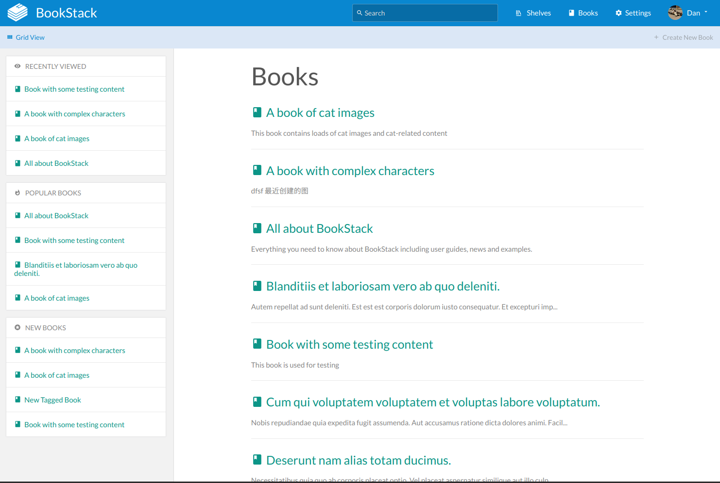
New Books List View
